Cylinder
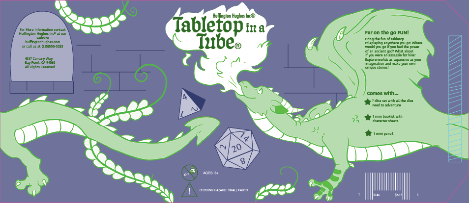
The cylinder project was the first project for the Package Design where we needed to design a cylindrical package for a children's toy. After some brainstorming, I made thumbnails of a product called "The Brick", "Mystery Cuddly Cavies" and "Tabletop in a Tube". I went with the last option because The Brick was too kitsch, and I liked the dragon making use of the cylinder to wrap around it like a castle tower.
Having the dragon wrap around the cylinder but also make sure that the face was the part that showed up on the front facing part of the cylinder was one of the biggest challenges of this project. The body had to line up perfectly on the seam where the glue line was so that it didn't look wrong, and it took a lot of fine tuning to get it to look good. When I did manage it though, it was worth the effort and looked amazing.
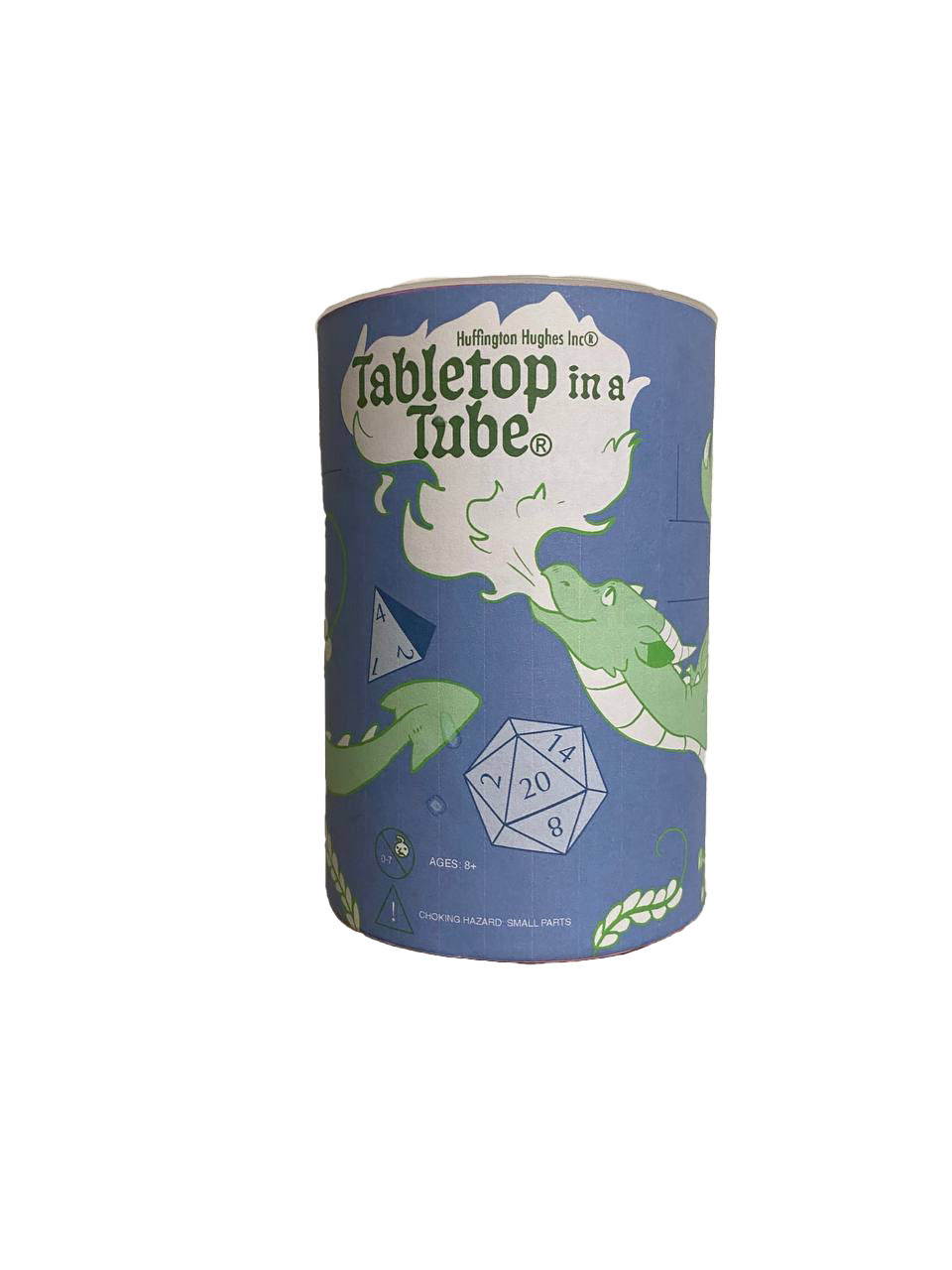
Front Side of final cylinder
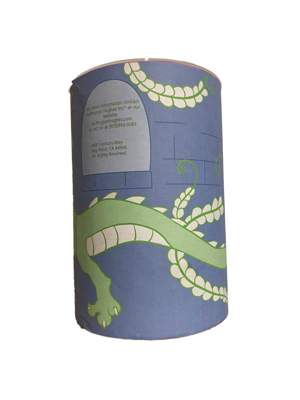
another side of final cylinder
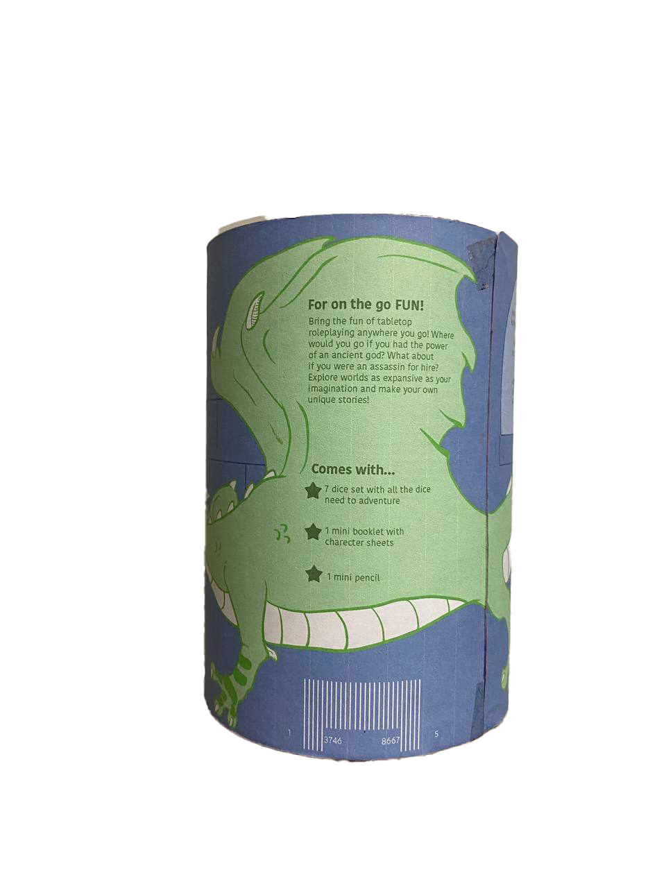
back of cylinder
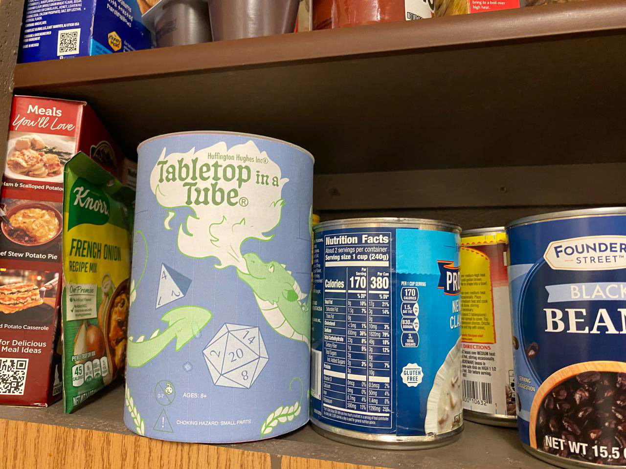
Cylinder on a shelf
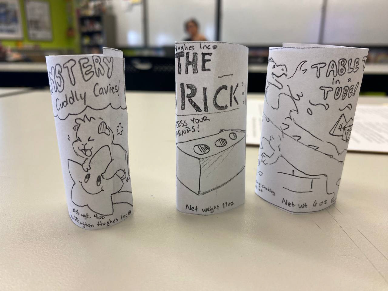
Thumbnail dummies of the cylinder project
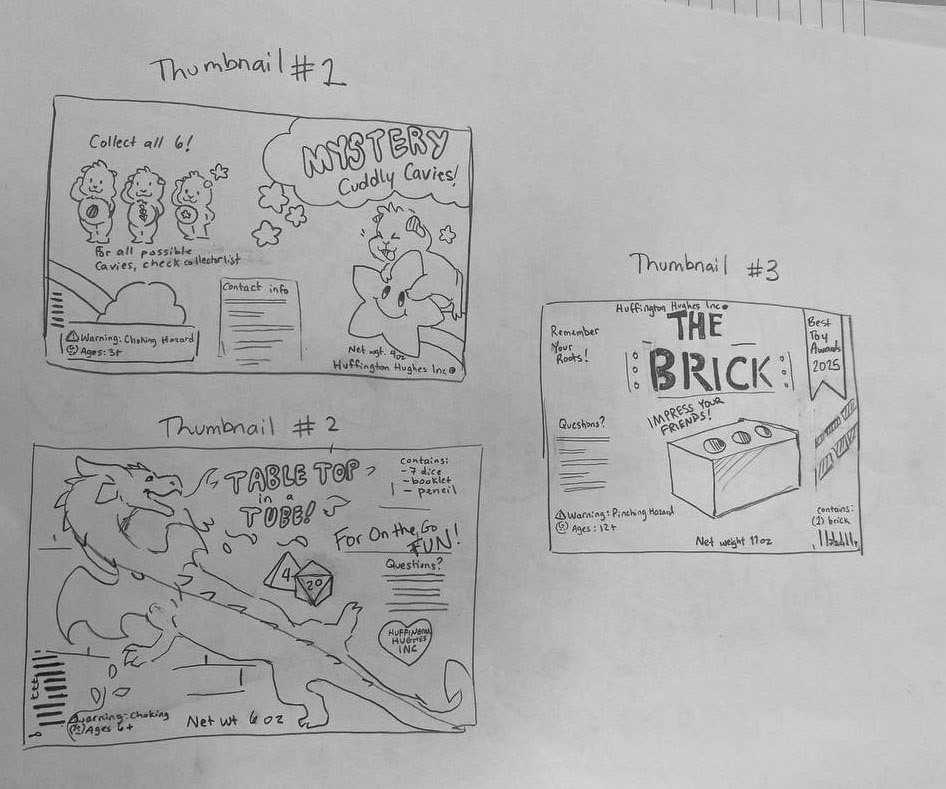
Flat thumbnails of the cylinder
Bag
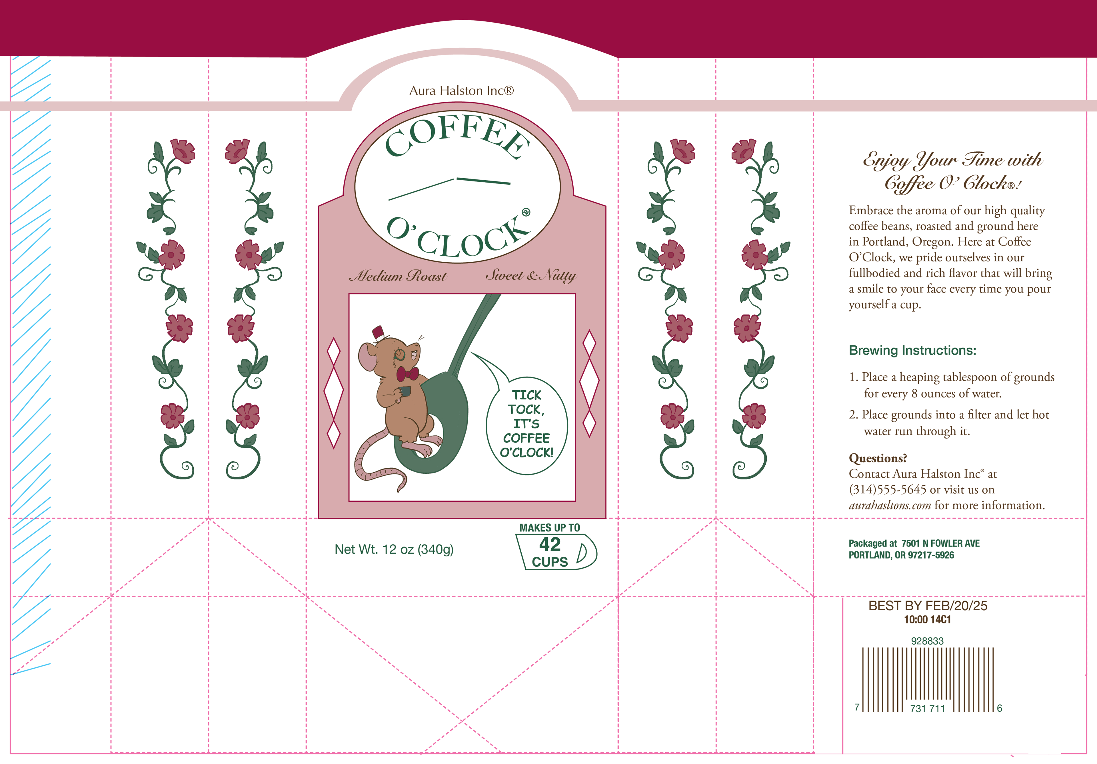
The bag project objective was to design a coffee bag for the brand Aura Halston Inc. My original ideas for the project were Coffee O' Clock, Cat Bean Coffee, and Spaced Out Coffee. Coffee O' Clock was the one I went with because I liked the little mouse a lot.
Because of the square shape of the bag, I wanted to make it resemble a grandfather clock with the mouse swinging on the pendulum in the middle. The front has a lot of personality in replicating that but the back is very disconnected from the front because I didn't know what to do about grandfather clocks in real life being a plain box in the back. I think this one could've used a little artistic liberty to make it look more like a clock.
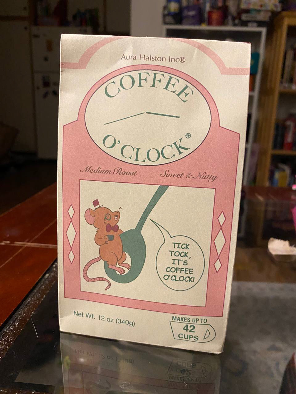
Front of the finished bag
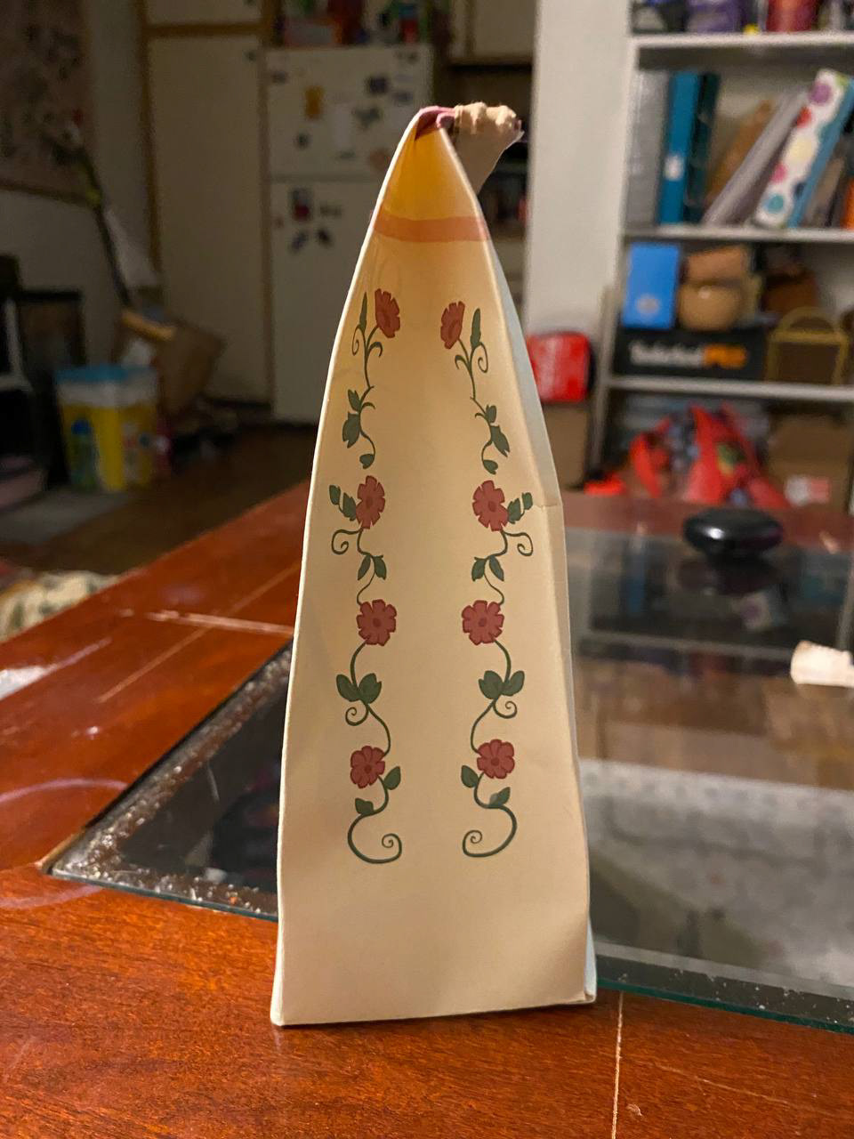
Side of the finished bag
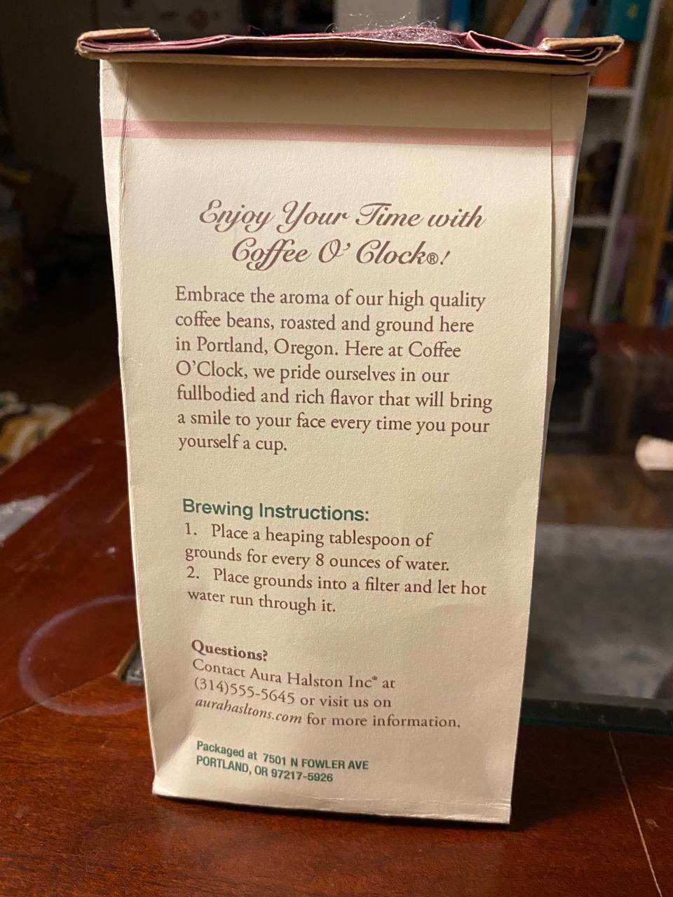
Back of the finished bag
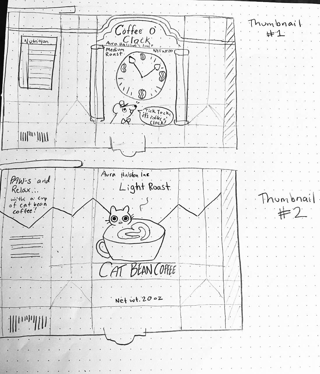
Two of the thumbnails for the bag project
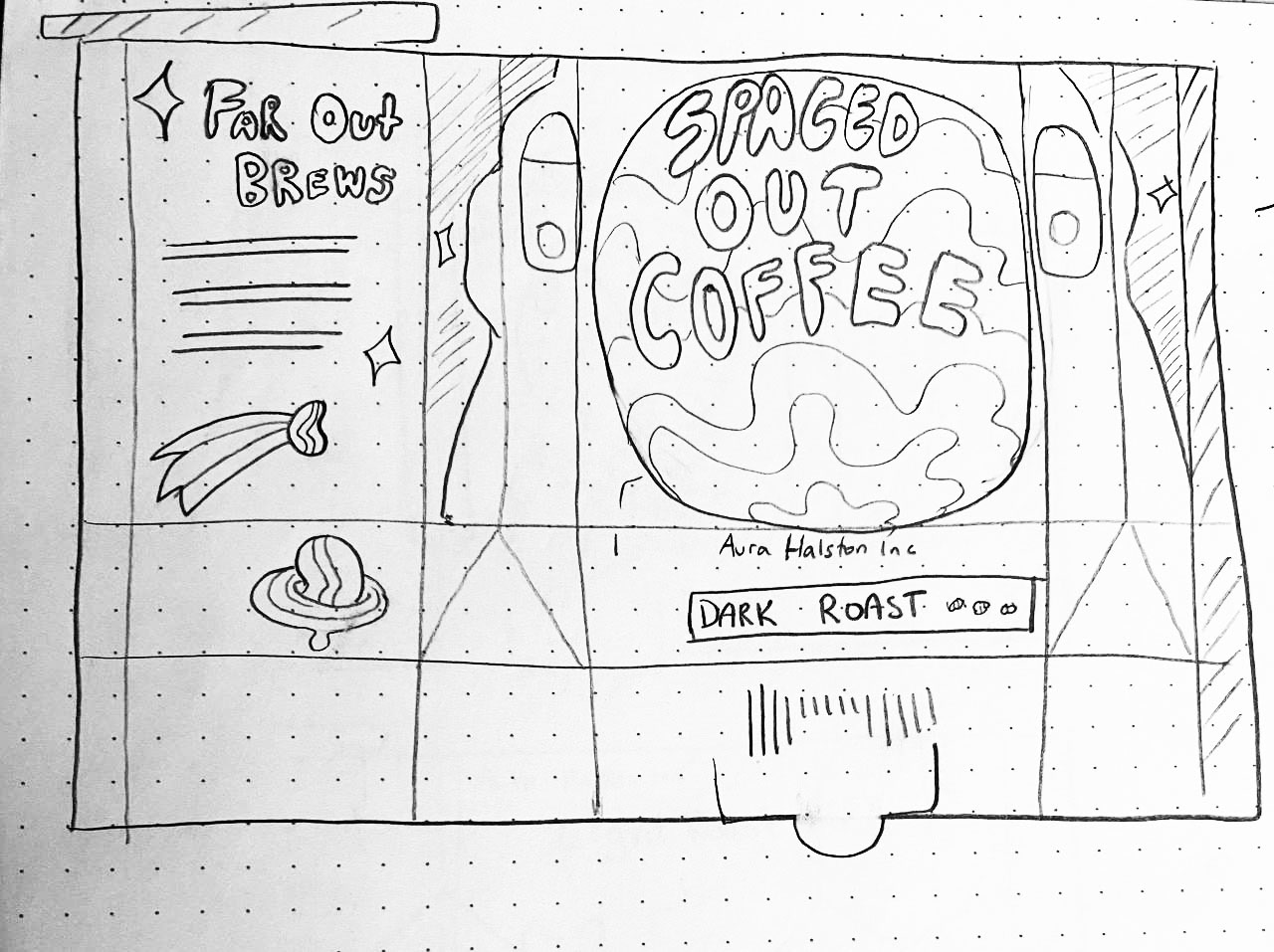
Third thumbnail for the bag project
Box
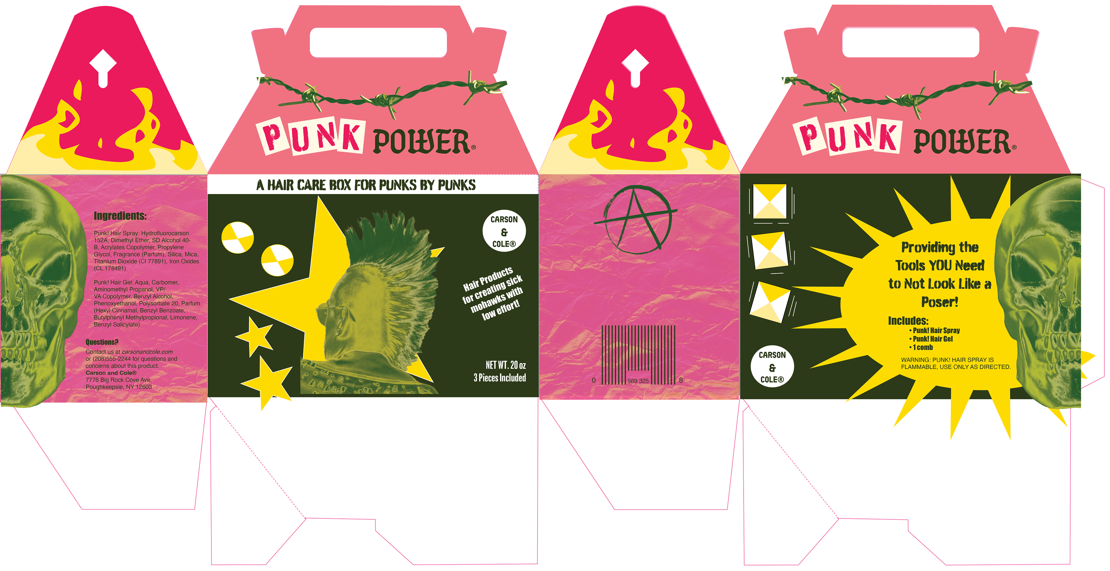
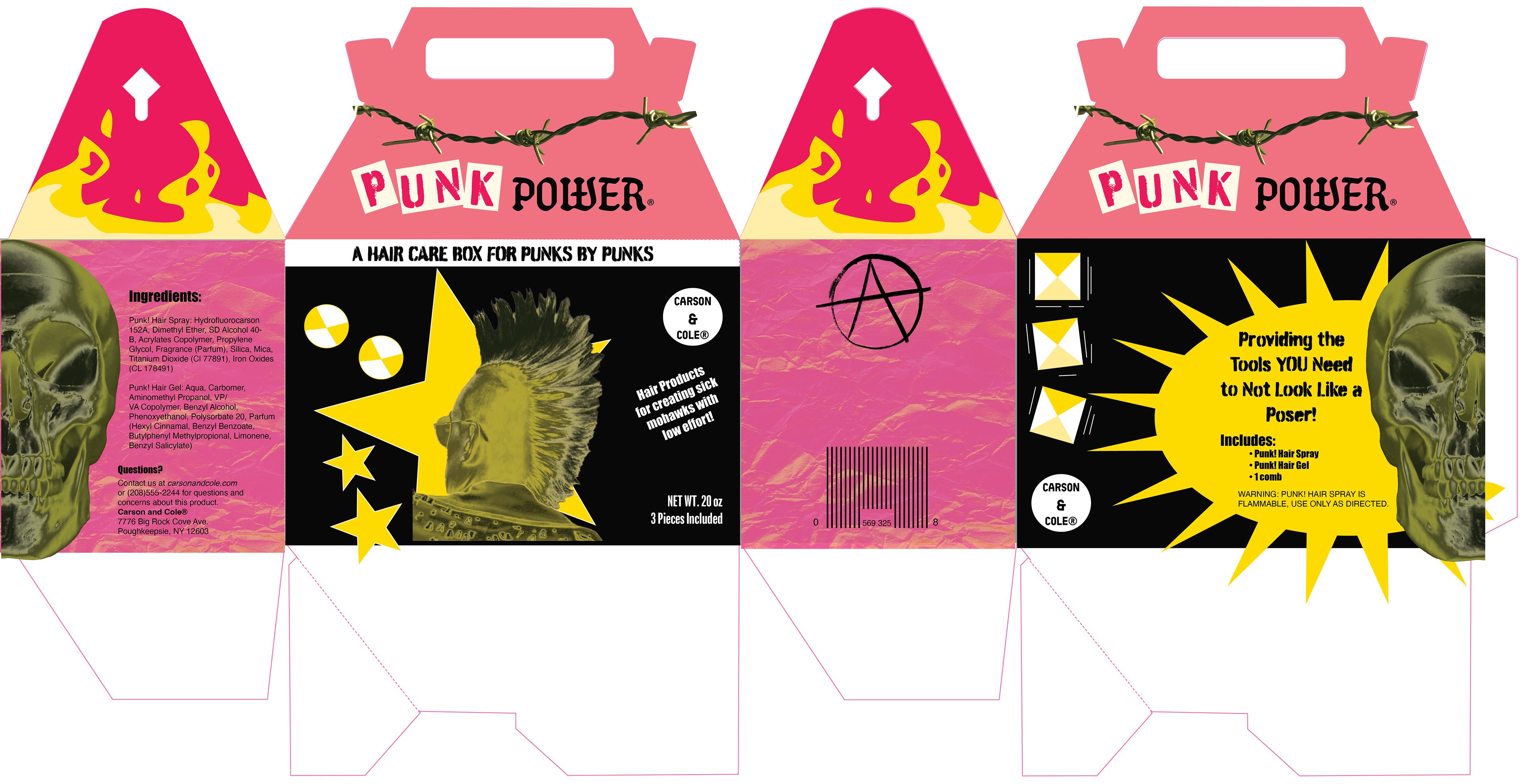
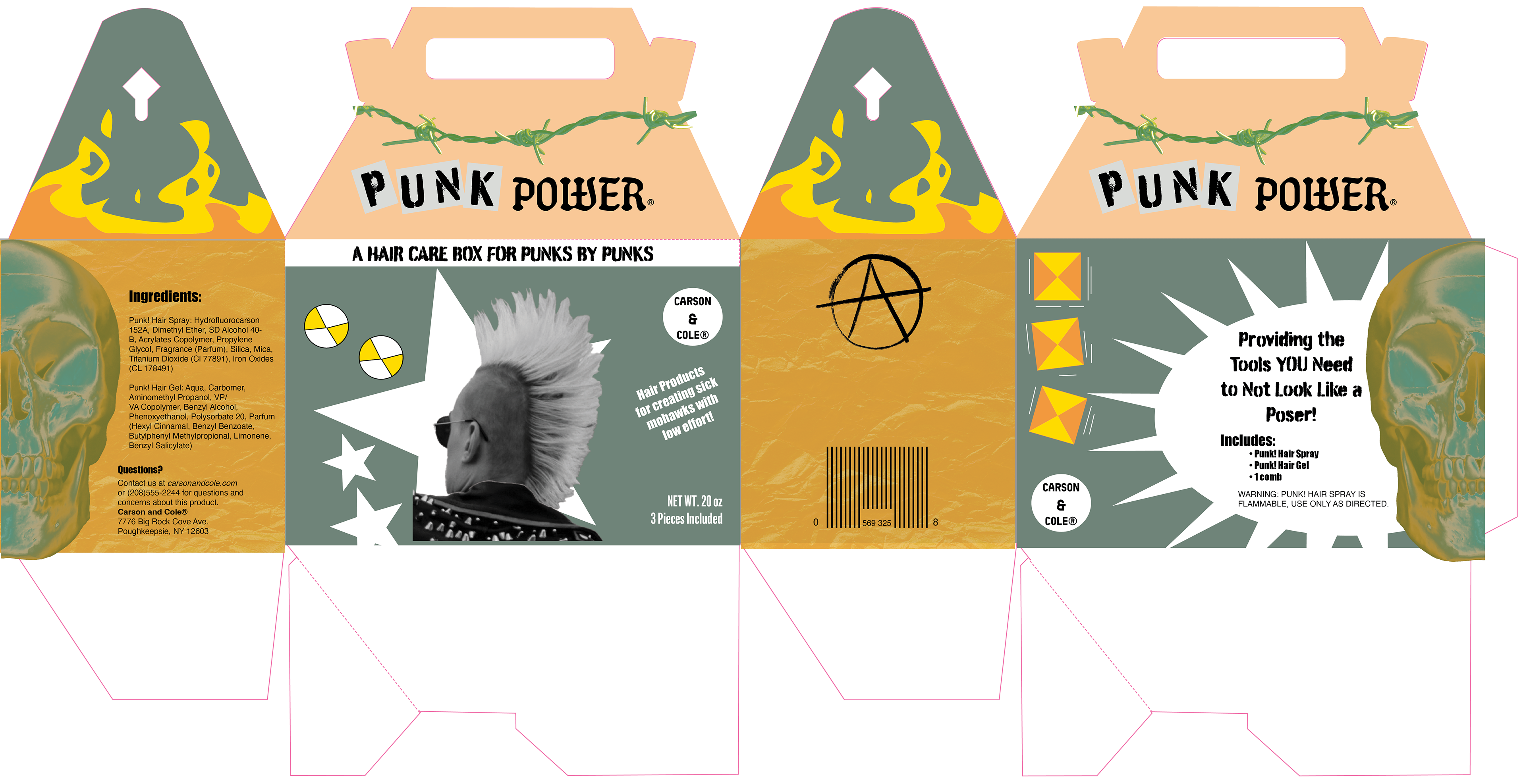
The box project had us design a gabled box for a beauty product. I only made two thumbnails for this one because I was in a time crunch, but it was between "Punk Prep" (later changed to Punk Power because of the HIV preventative drug sharing the same name) and "Pâtisserie SPA". I went with the Punk Power because I thought that the French one was boring and I had more ideas for the punk box.
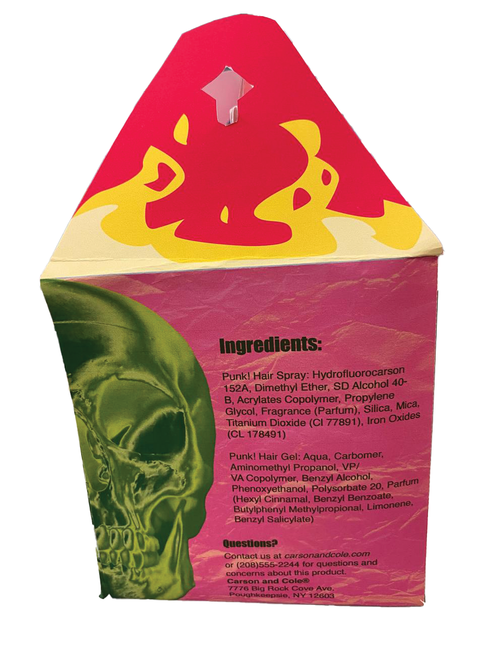
The very vibrant color scheme for this box is easily my favorite part of this project and it was surprising to me considering how different my original ideas for colors were. My original concept for the colors before I sat down and was choosing the colors for the final was black, white, and red. However, when I was experimenting and came along this color combination, it really stood out to me. The bright colors also added to my desire to make this marketed towards young punks who want a guide on styling their hair into a mohawk. I imagined that this product would fit well on the shelves of a Hot Topic.
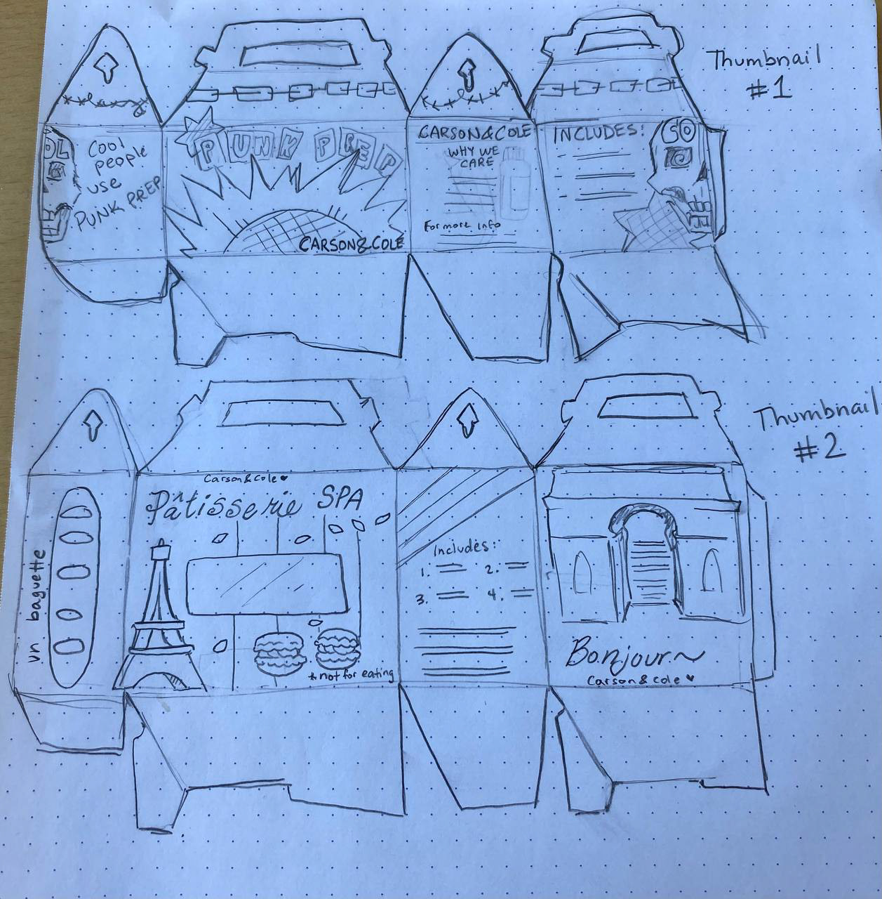
Thumbnails for the box
Slightly different color test with black instead of green
Another color test
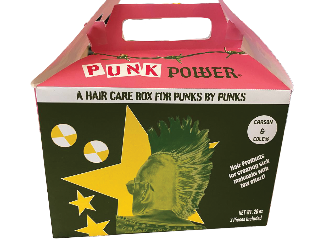
Final box
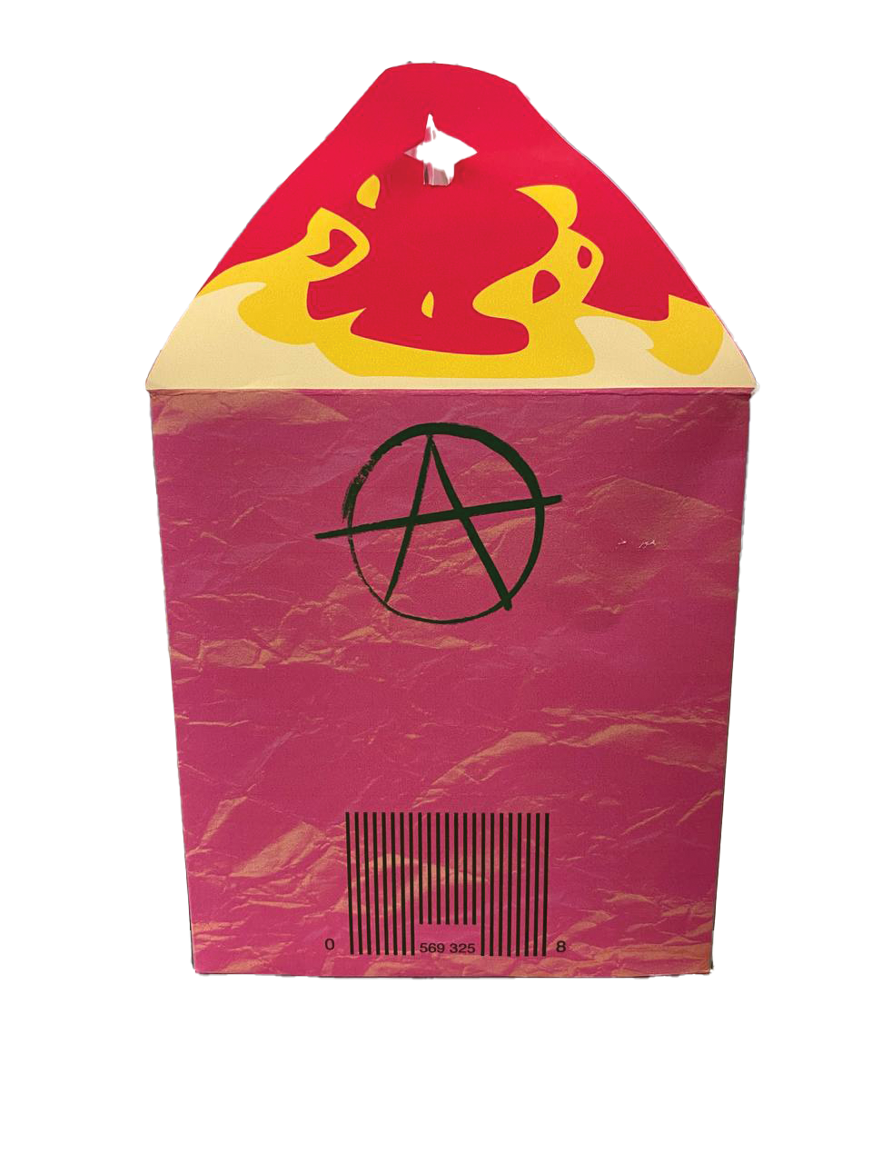
Final box second view
Final box third view
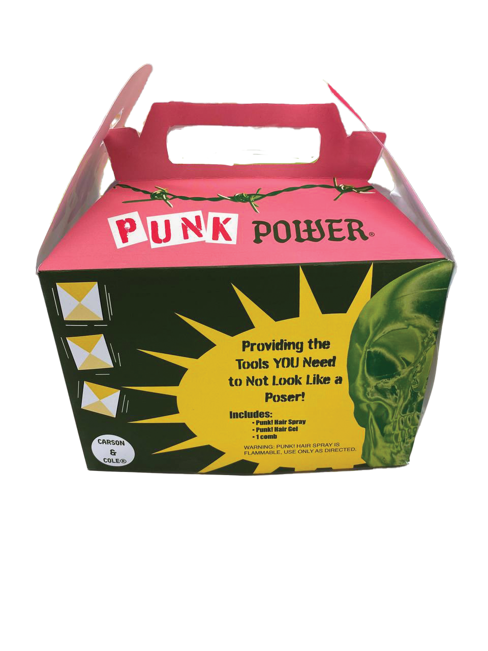
Final box front view
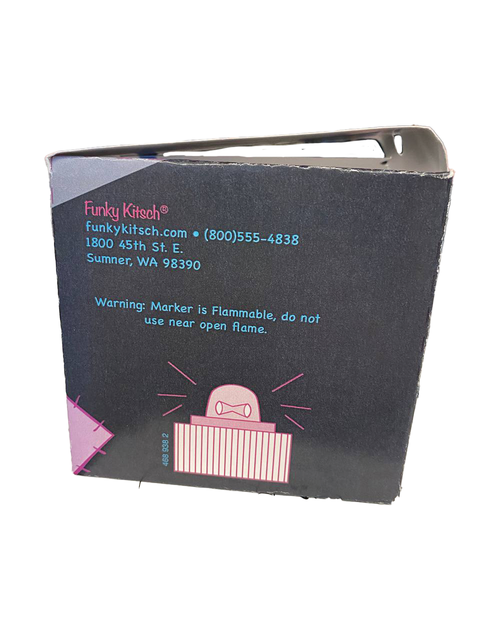
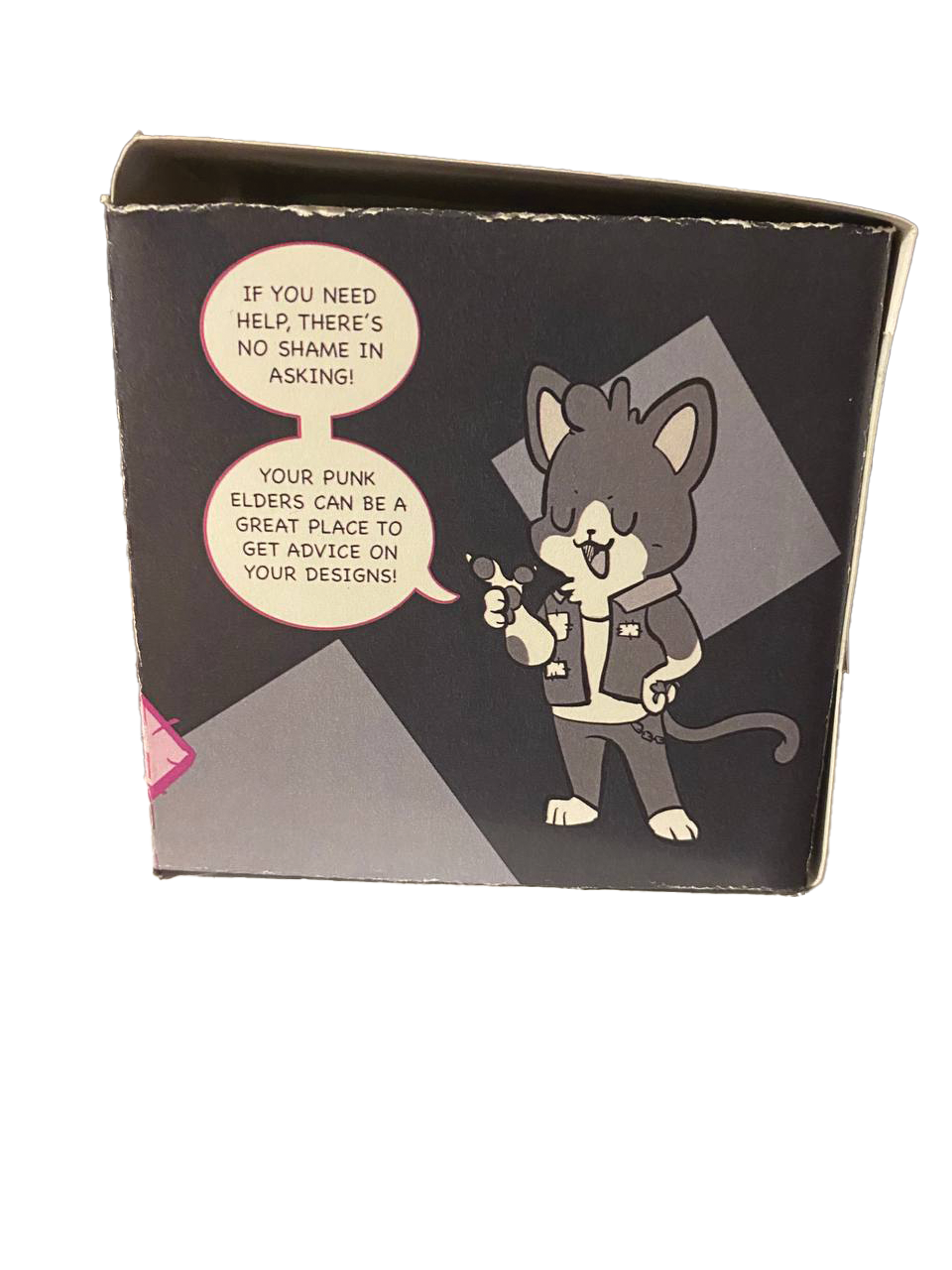
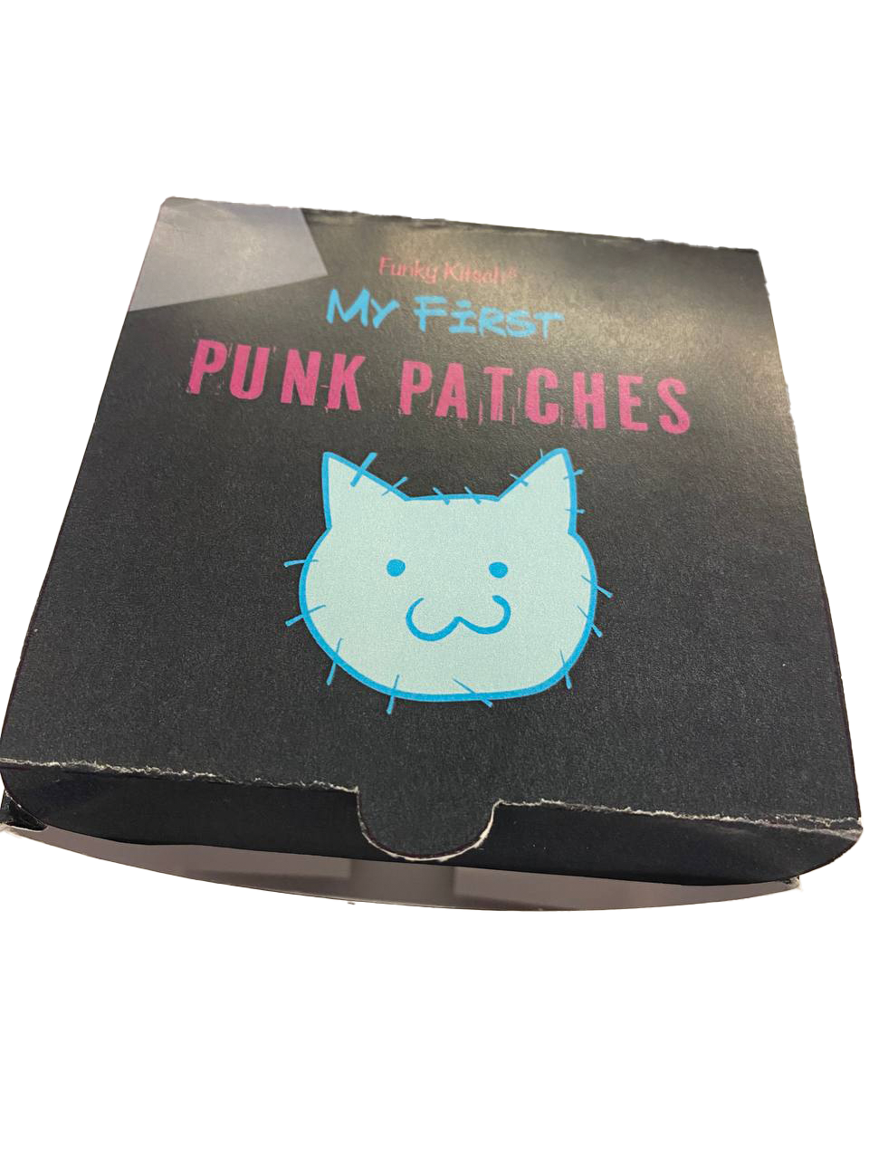
Kitsch
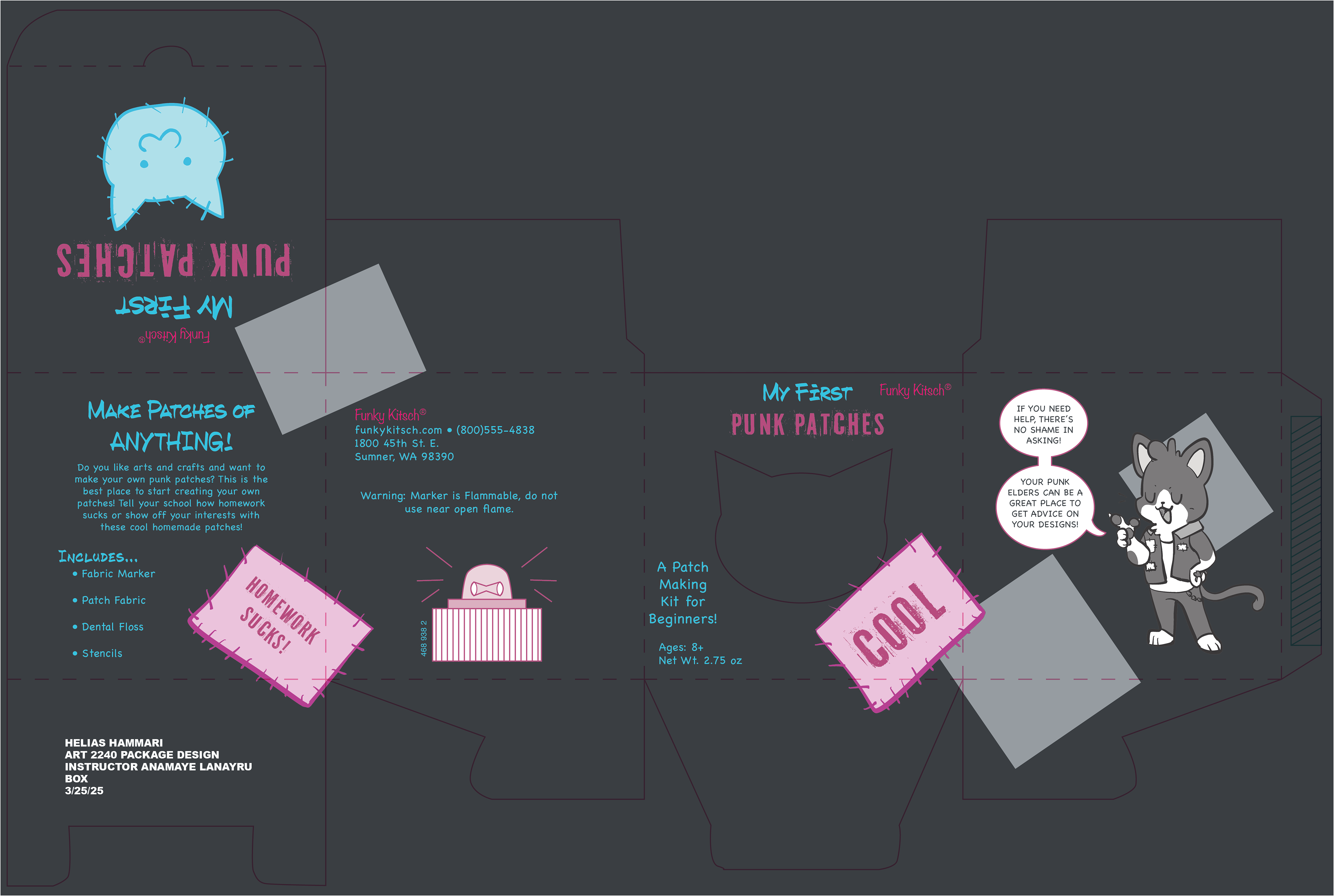
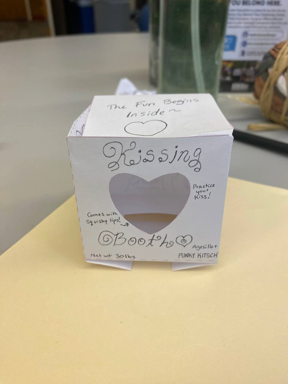
The kitsch project was the most complex project to do but also one of the most fun. Kitsch is a term to describe any art that someone does not like, and often refers to tacky art creations like garden gnomes or pink lawn flamingos. I did mine as a connecting piece to Punk Power by targeting that same audience of teenagers and tweens who want to get into the punk scene. This time this product was for making patches for a battle jacket.
The original idea that I had for this box especially in the earlier dummies was of a stone bust with squishy lips to let people practice kissing if they felt nervous about kissing, but I didn't have the bust for that and it would've been more work than I could do. I also wanted to make something similar to a series for my portfolio and thought that connecting to my box project would be a great thing to show in my portfolio.
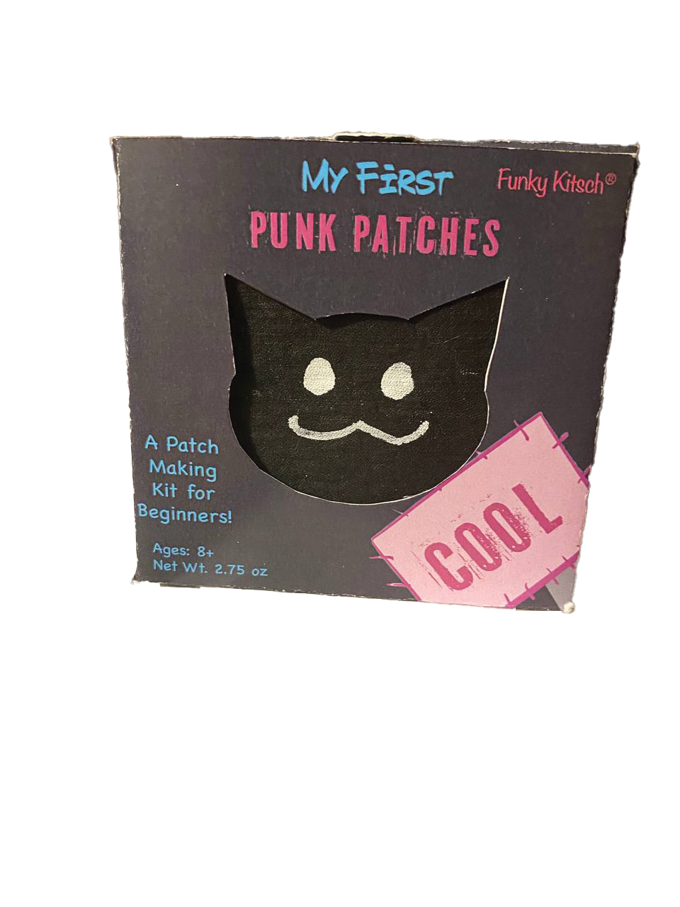
Front of Kitsch final box
Side of the final Kitsch box
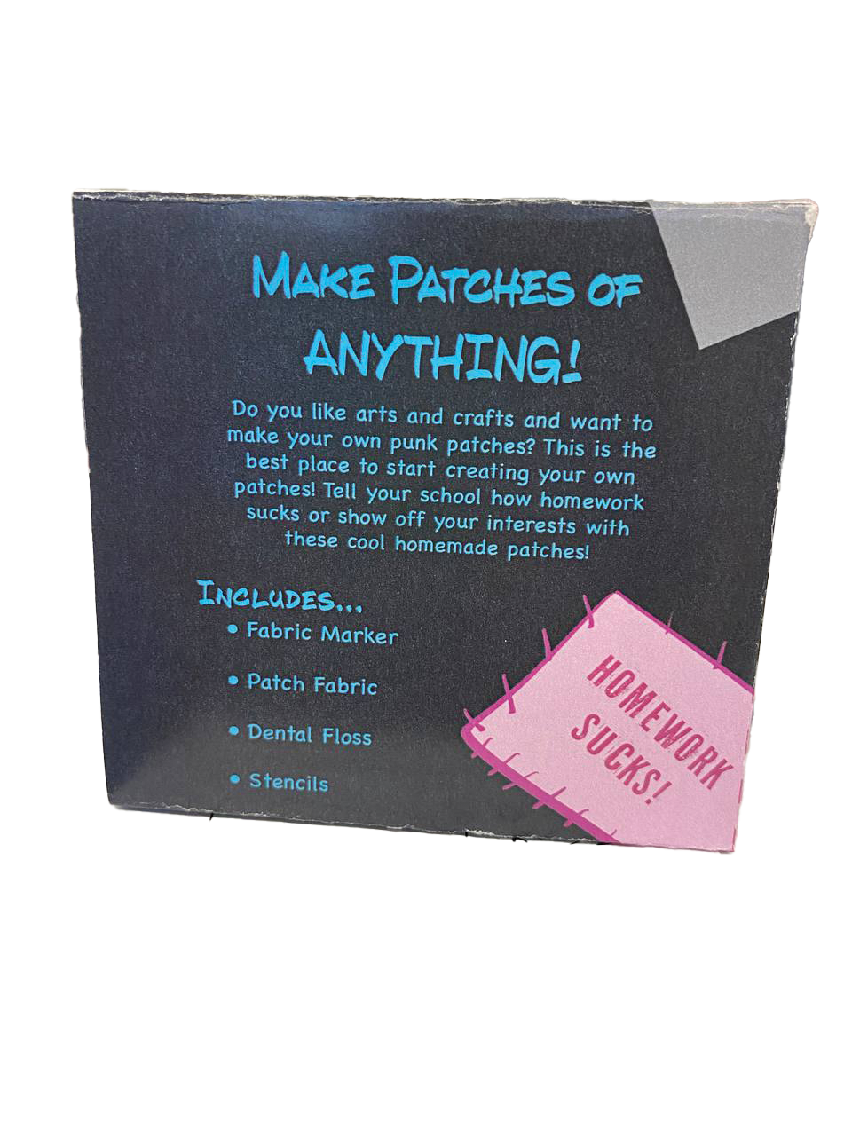
Back side of the Kitsch final box
Other side of the Kitsch final box
Top of the Kitsch box
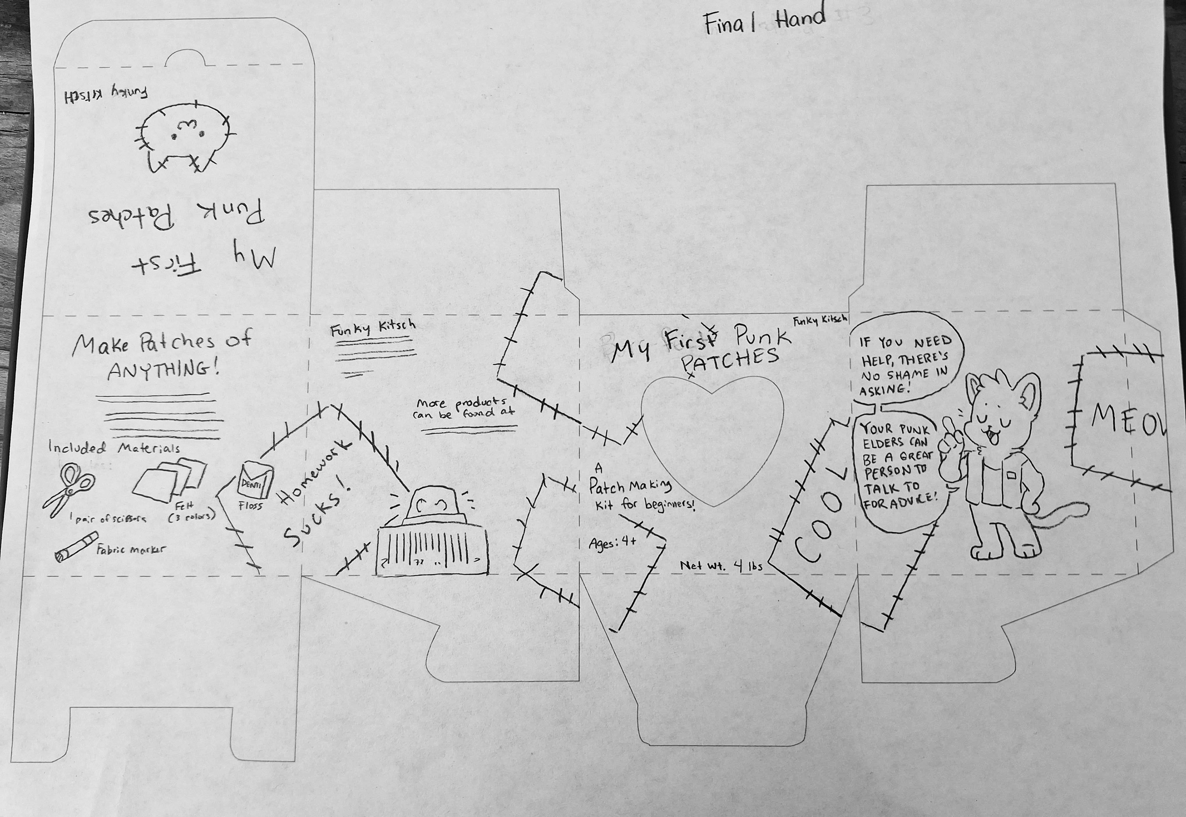
Final Hand of Kitsch
Thumbnail dummy before change
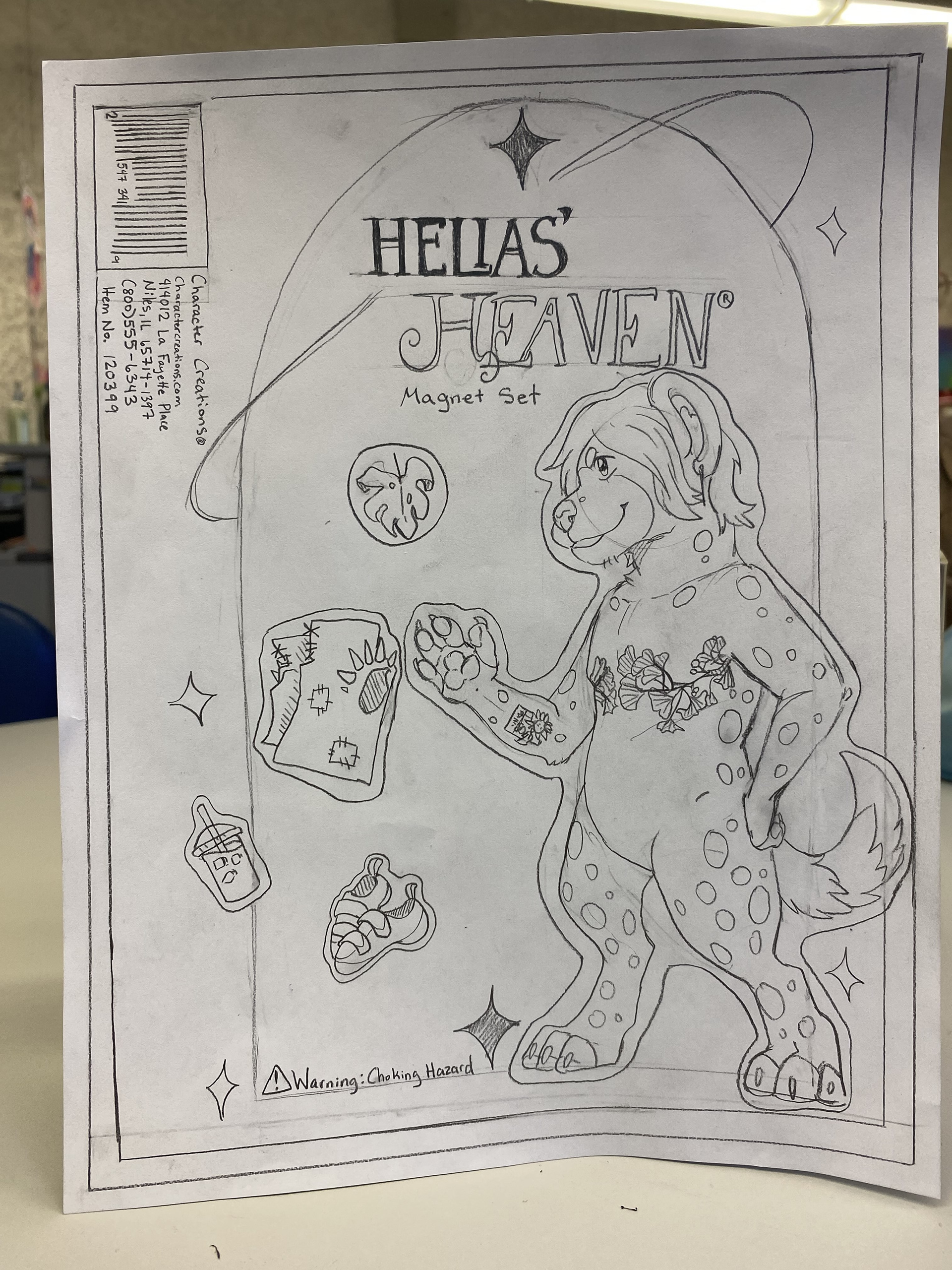
Magnet
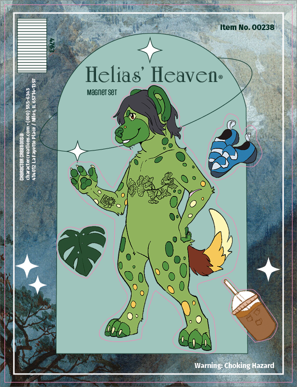
The magnet project was to make a magnet set of ourselves. I chose to do my fursona that shares the same name as me as well as some items that I like a lot. I was inspired by Frasurbane graphic design and that art pieces that are older than 100 years are public domain, so I combined those when making this.
I included my favorite things which is rock climbing, coffee, and plants in this with the various items around the main figure. The Frasurebane style is also something that I really enjoy, and old art, so it made sense for me to include it in a piece about myself.
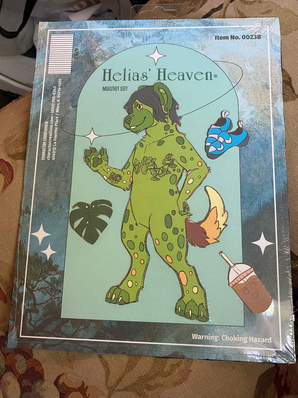
Magnet final piece
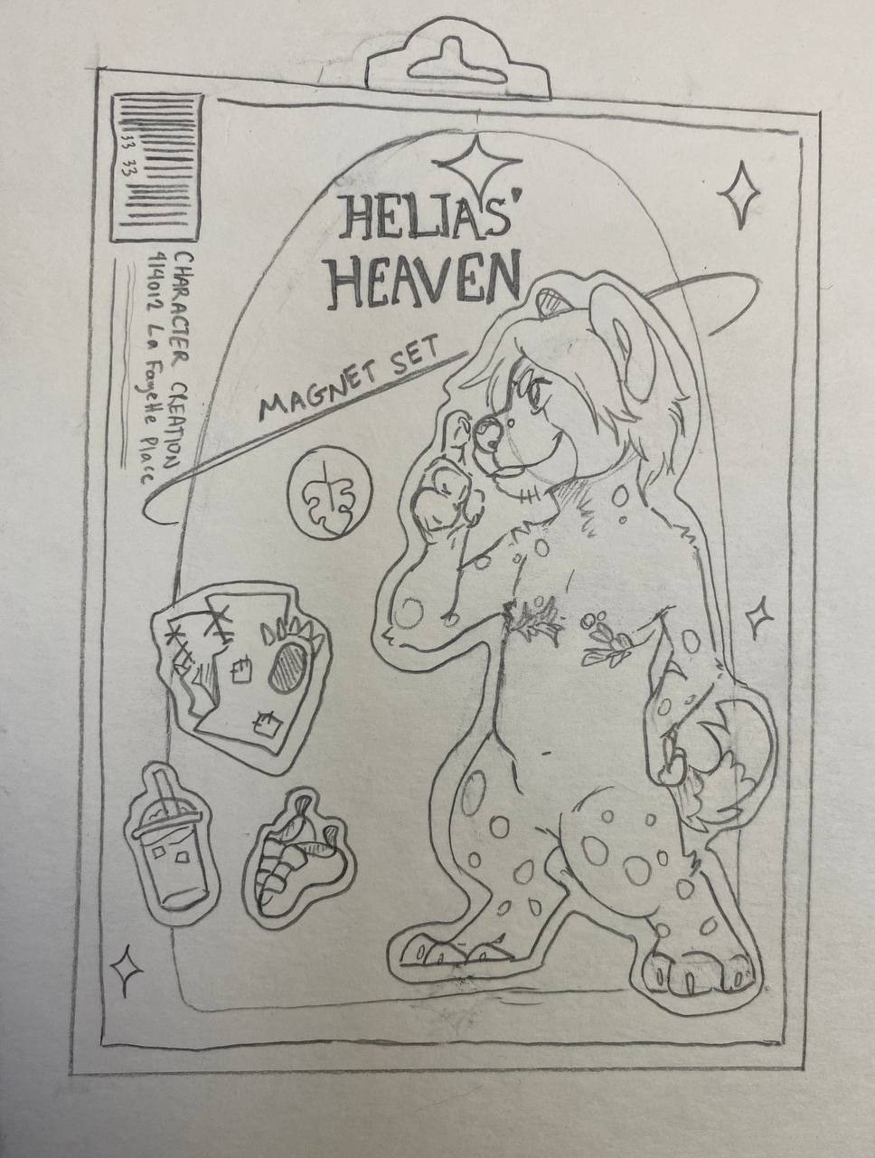
Magnet Intermediate